Georganics

Branding, Graphic design
Adobe Creative Suite (Illustrator, Photoshop), Figma, ChatGPT, Midjourney, Klaviyo

Project Overview

Georganics is a UK-based company that focuses on natural, sustainable oral health care products. Founded with the mission to create effective, eco-friendly alternatives to conventional oral care products, Georganics emphasizes the use of high-quality, natural ingredients and minimalistic, plastic-free packaging. Their product range includes toothpaste, mouthwash tablets, dental floss, and toothpowder, all formulated without synthetic chemicals, artificial flavors, or preservatives.

My Contributions

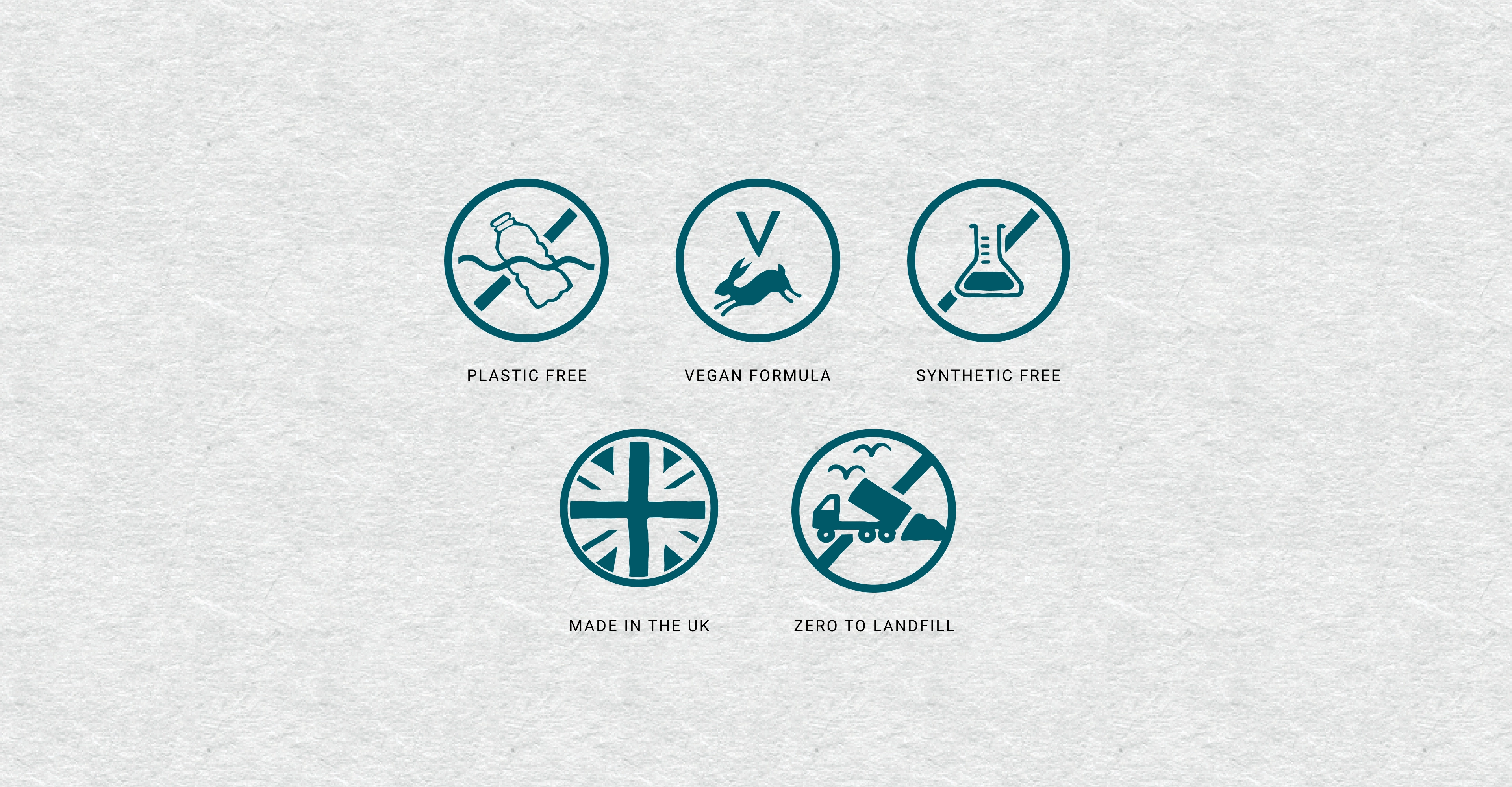
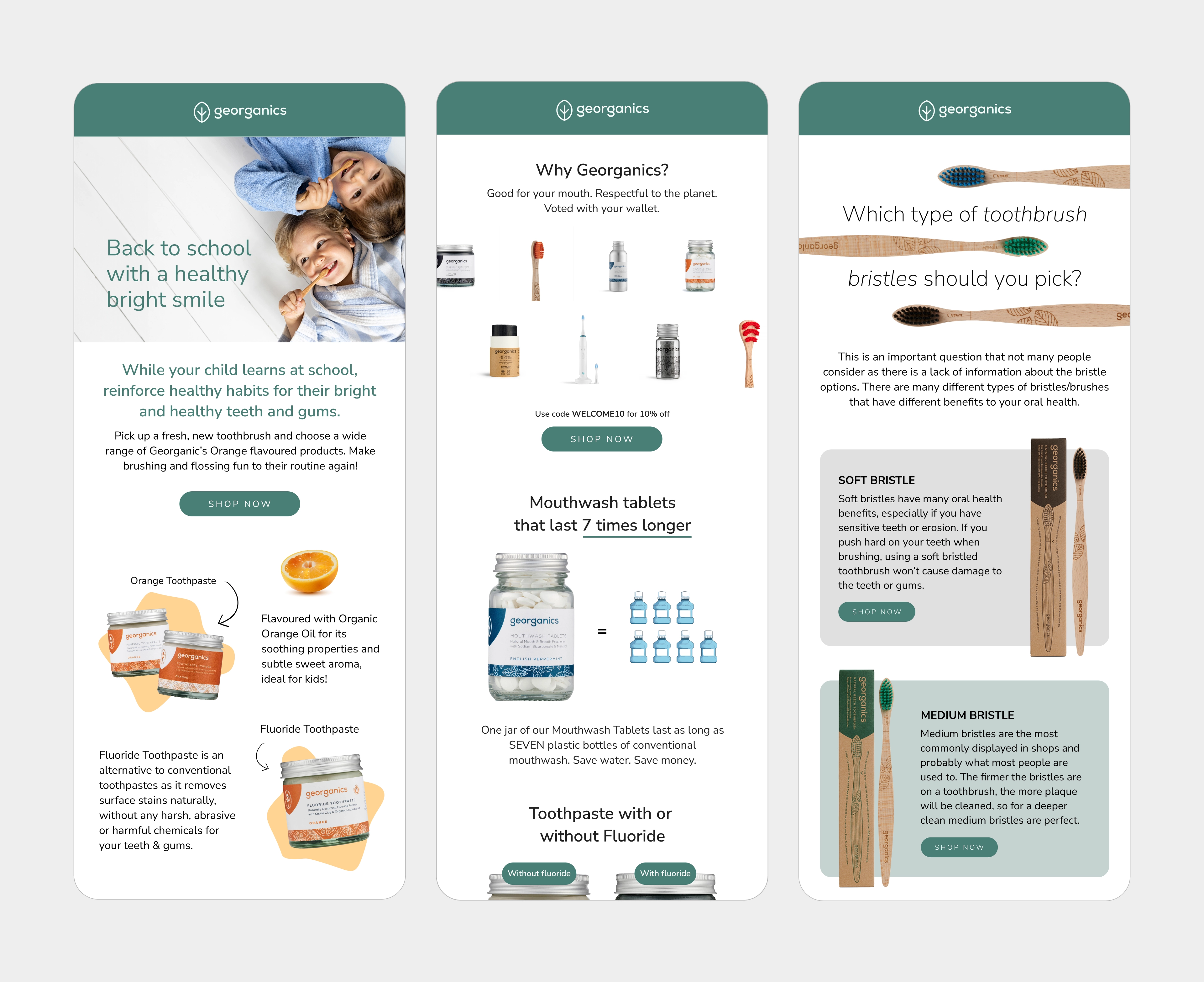
I collaborated with Georganics to enhance their creative materials, focusing on improving their brand palette, icon illustrations, email designs, and various other digital assets. This partnership aimed to align Georganics' visual identity with their commitment to natural and sustainable oral health care.

By refining the brand palette, I ensured a cohesive and appealing aesthetic. The new icon illustrations provided a clear and engaging way to represent their products and values, while the redesigned email templates enhanced customer communication, maintaining a consistent brand voice and visually appealing format.
Expanding the Brand Palette
To strengthen Georganics’ visual identity and reflect their commitment to natural, sustainable oral care, I introduced an extended colour palette inspired by organic ingredients and eco-friendly materials. The new palette balances freshness with credibility,  combining natural hues like Kraft Natural and Kraft Warm (drawn from their recyclable packaging) with vibrant botanical tones such as Peppermint, Spearmint, Eucalyptus, and Tea Tree. Each tone corresponds to a key product variant, creating a clear visual link between product ingredients and packaging design.

I also added functional colours such as Activated Charcoal and Neutral Dark Grey for structure, contrast, and legibility across both digital and printed materials. This ensures the identity feels modern, clean, and flexible; while maintaining its organic authenticity. Overall, this system created a cohesive, ingredient-led brand language that works consistently across packaging, digital touch points, and in-store displays.
As part of Georganics’ commitment to transparency and sustainability, I designed a set of bespoke icons to visually communicate their core values and product promises. Each icon was created in a clean, minimal style to reflect the brand’s natural ethos while remaining instantly recognisable and easy to use across packaging, digital, and marketing assets.

Plastic Free: I illustrated a crossed-out plastic bottle and bag to symbolise the brand’s dedication to eliminating single-use plastics, reinforcing their eco-conscious mission.
Vegan Formula: To highlight that Georganics products are completely plant-based and cruelty-free, I designed a simple emblem featuring the “V” symbol paired with a leaping hare, which also subtly nods to cruelty-free associations.
Synthetic Free: A chemistry flask with a strike-through was drawn to clearly communicate the absence of artificial ingredients or harsh chemicals in their formulas.
Made in the UK: I used a stylised Union Jack to emphasise the brand’s roots and local production, keeping the design bold yet minimal so it works across scales.
Zero to Landfill: To capture their sustainable waste practices, I illustrated a crossed-out landfill truck with flying birds above, signalling a positive and environmentally responsible outcome.

These icons were designed not just as functional markers but as part of Georganics’ brand storytelling. Their consistent visual language helps build trust with conscious consumers, reinforces ethical values, and ensures the packaging communicates sustainability at a glance.
I collaborated closely with Georganics’ marketing team to brainstorm and develop creative advertising concepts that aligned with campaign objectives and audience insights. This included generating ideas for visuals, themes, and messaging that clearly and effectively communicated the campaign’s message.
I designed, wrote, and produced Georganics’ weekly marketing emails using Klaviyo for deployment and Figma/Photoshop for visual design. By tailoring content and visuals to specific customer segments, the campaigns consistently achieved an average open rate of 52.75%, a click-through rate of 5.64%, and a 4% placed order rate.

See more projects

Want to work together?