J&Josh
Art Direction, Digital Assets, Print Production
Illustrator, Photoshop, Procreate, Canva, Kling 2.5
Project Overview
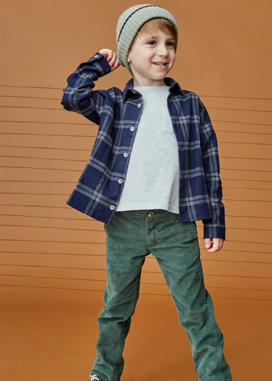
J&Josh is a London-based childrenswear brand founded by Dayle Fattal, inspired by her two sons, that creates timeless, modern-classic clothing for kids aged 2–14. The brand focuses on high-quality natural fabrics, sustainable and ethical production with European family-run artisans, and designs meant to be durable, stylish, and passed down rather than discarded. It positions itself between fast fashion and luxury kidswear, appealing to parents who value authenticity, craftsmanship, and longevity in children’s clothing.
I worked closely with J&Josh’s founder to understand their target market and competitors. This collaboration aimed to identify opportunities to elevate their branding, email design, ads, packaging and other marketing collaterals.
My Contributions
I revitalised J&Josh’s brand identity by introducing new design elements including bespoke icons, an expanded colour palette, a sub mark, and custom textures. I also designed fresh email templates in Klaviyo that delivered clear, engaging messaging while maintaining brand consistency across weekly newsletters.
To support the wider team, I implemented Canva as a tool for non-design staff, enabling them to create visuals for Klaviyo without relying on Photoshop. The refreshed identity was well-received and has since been applied across the website and wider marketing channels.

Olive Green

Ocean

Willow

Powder

Stone

Cloud
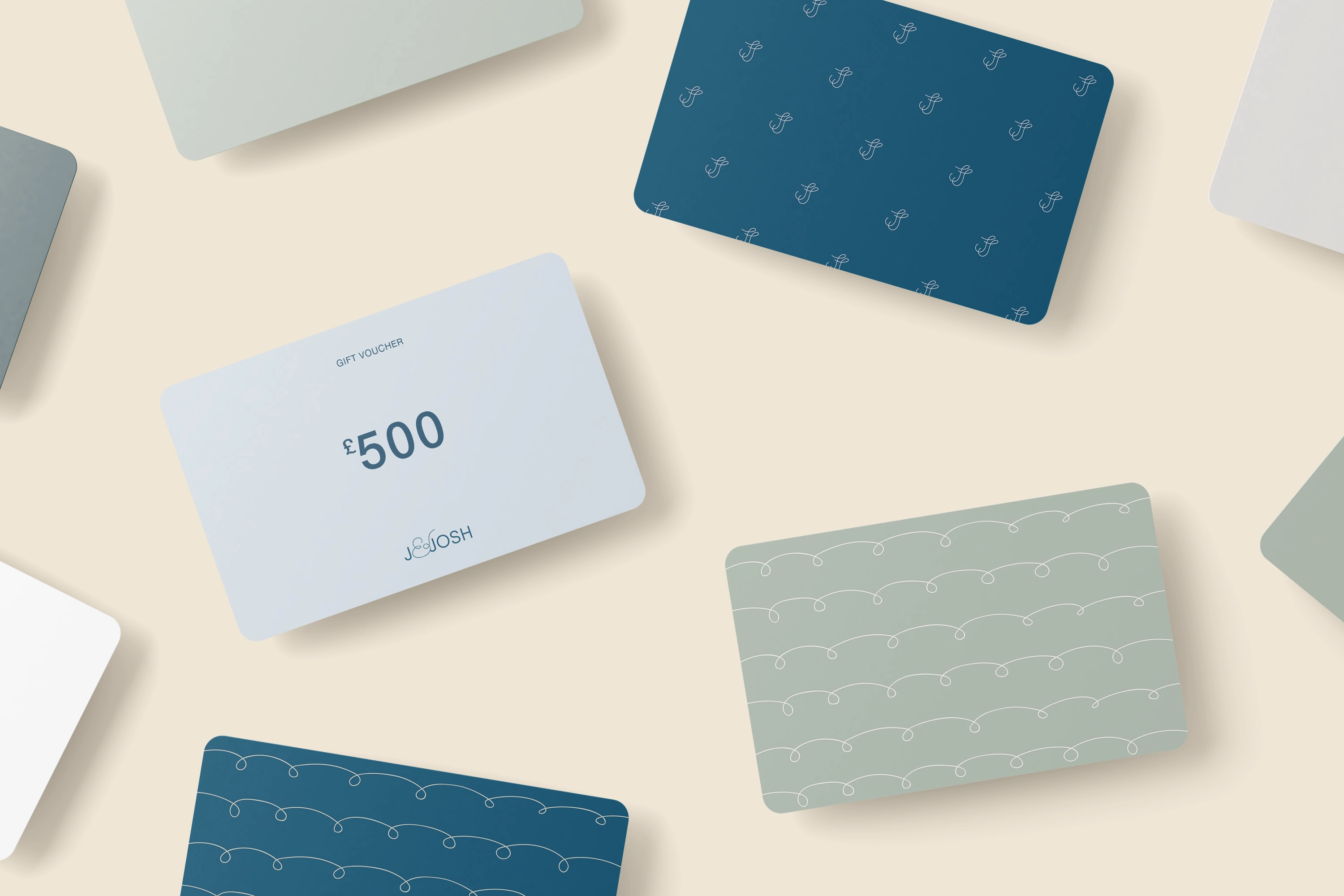
Brand Colour Rationale
The refreshed J&Josh palette was developed to reflect the brand’s ethos of timeless, sustainable childrens wear. Each colour was chosen to balance natural inspiration with a modern classic aesthetic:
• Olive Green & Willow introduce a calm, nature-driven foundation that reinforces the brand’s sustainable and authentic values.
• Ocean provides a strong, heritage-inspired anchor, conveying trust and quality while adding depth to the identity.
• Powder, Stone & Cloud bring softness, purity, and versatility, creating a light, understated backdrop that highlights the clothing and storytelling without overpowering it.
Together, the muted, earthy tones move away from fast-fashion brights and instead position J&Josh as a brand focused on durability, elegance, and designs that remain relevant across seasons. This palette now extends consistently across digital, print, and marketing materials, ensuring a cohesive brand experience.

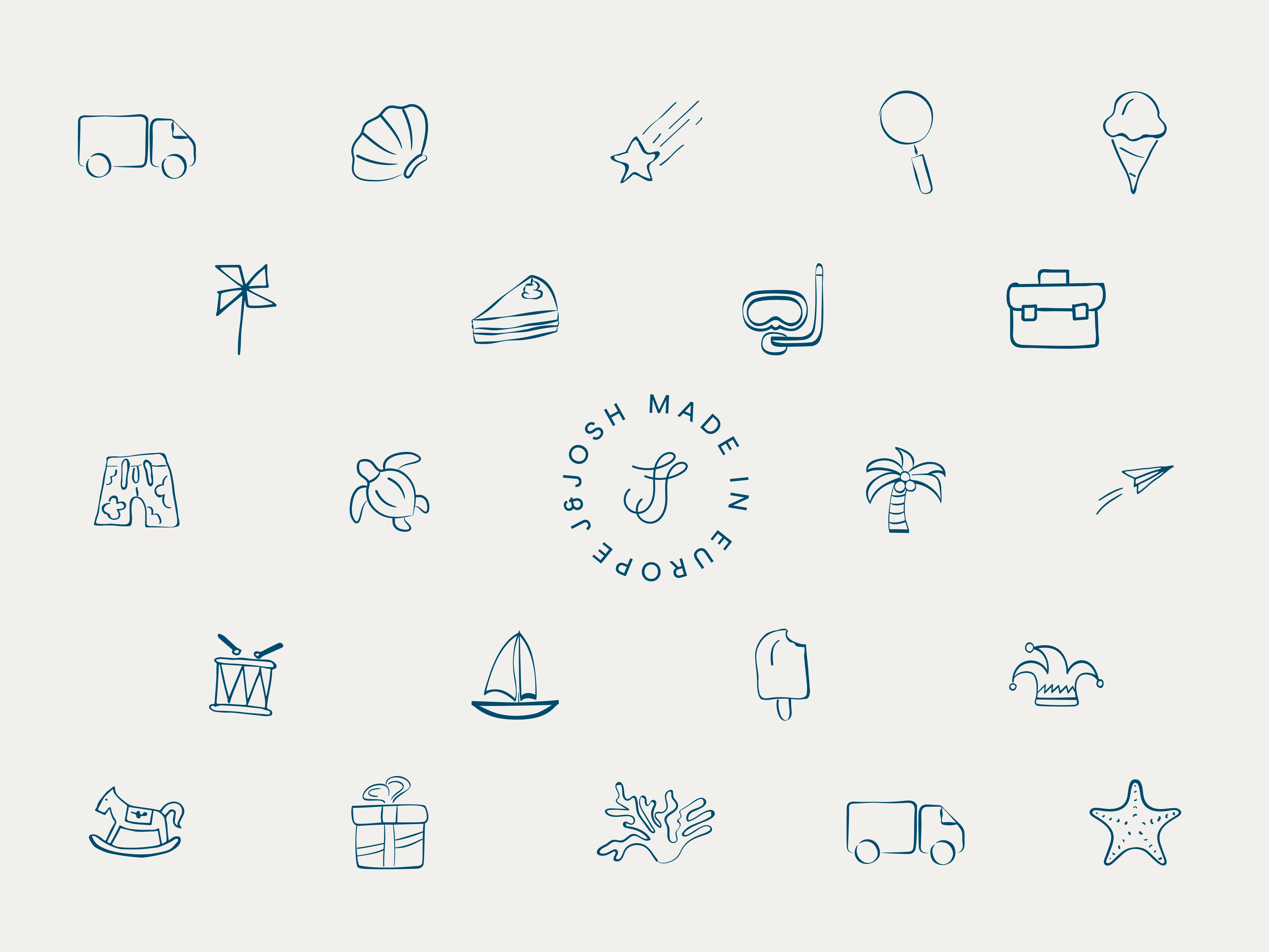
Bespoke Icons
As part of the brand refresh, I developed a suite of hand-drawn icons to add a playful, childlike dimension to J&Josh’s visual identity. Each illustration ranging from seashells and turtles to kites and musical instruments, was designed to capture the spirit of childhood curiosity, adventure, and imagination.
The icons were deliberately kept simple and line-based to align with the brand’s clean, timeless aesthetic, while their organic strokes introduced warmth and approachability. This icon set is flexible, working across email templates, packaging, and digital touchpoints to create moments of visual delight and reinforce brand personality without overwhelming the minimalist design system.
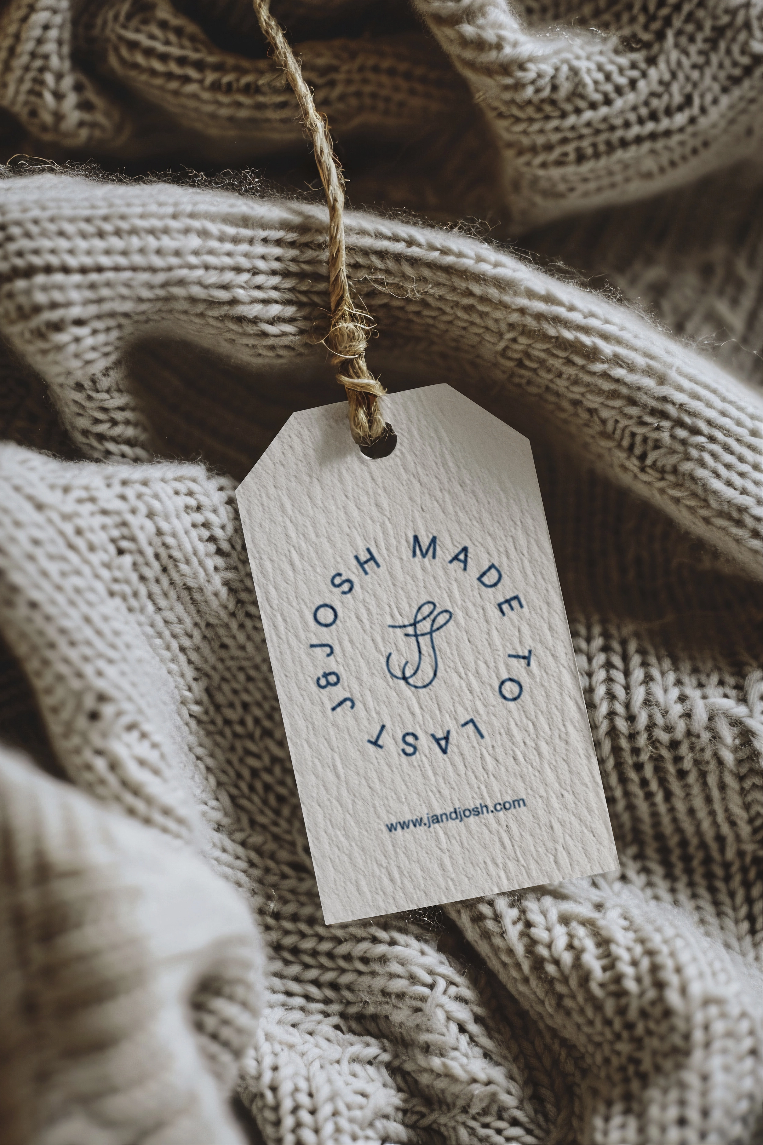
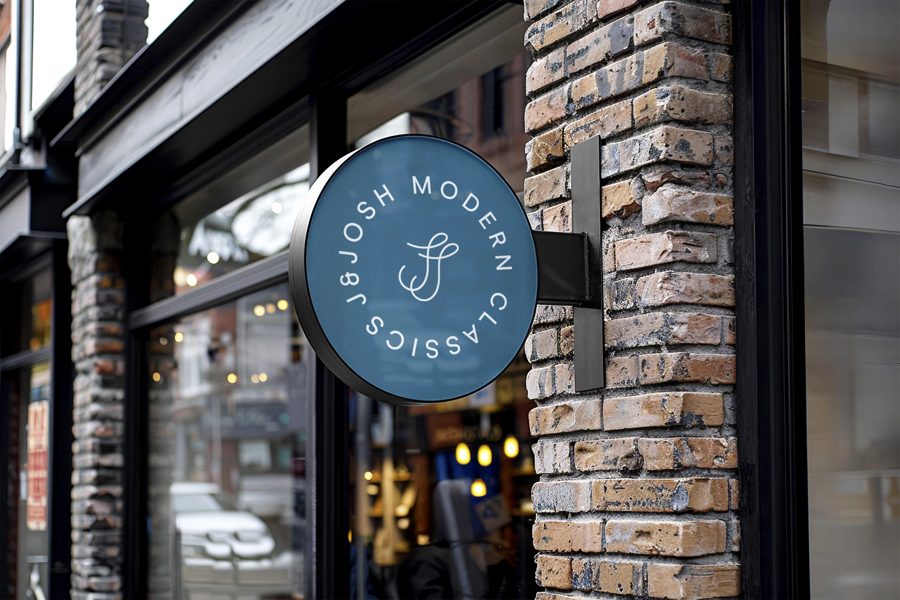
Logo Sub Marks
Alongside the refreshed brand identity, I developed a series of sub marks to extend J&Josh’s visual toolkit and create adaptable assets for use across packaging, digital, and marketing touch points. The monogram (“JJ”) mark is a simplified, elegant shorthand for the brand, designed with fluid, looping lines that echo both the playfulness of childhood and the sophistication of a premium, timeless label.
Circular lockups such as “Made in Europe” and “Made to Last” reinforce J&Josh’s core values: craftsmanship, sustainability, and durability while also acting as quality seals that can be stamped across digital and physical materials.
Finally, the “Made to Play” sub mark, paired with a hand-drawn paper plane, adds a lighthearted, imaginative tone to balance the more formal marks. This ensures the brand communicates not only quality and longevity, but also the joy and curiosity at the heart of childhood.
Together, these sub marks provide J&Josh with a flexible identity system that can shift between playful, premium, and ethical positioning depending on the context, without losing overall cohesion.
Brand Patterns
To enrich J&Josh’s design system, I created a series of repeatable patterns that expand on the refreshed palette and iconography. The patterns were designed with versatility in mind, functioning as subtle brand assets that could be applied across packaging, digital backgrounds, and marketing materials. Each pattern draws inspiration from childhood and nature: looping wave motifs, hand-drawn line textures, and repeating brand sub marks. The imperfect, organic strokes echo the brand’s hand-crafted and sustainable ethos, while the muted colourways keep the look timeless and understated.
These patterns introduce visual depth and flexibility, giving J&Josh a toolkit of assets that can be layered into different applications, from playful touches on newsletters to more elevated treatments on packaging, while maintaining a cohesive and recognisable identity.
Results
J&Josh's has seen positive results from the rebranding, including the following benefits:
More Engagement
User engagement increased significantly, with longer average session durations on the website and a rise in social media interactions, enhancing J&Josh’s visibility.
MQL leads increased
High-quality visuals attracted users to inquire about J&Josh’s products. A memorable tone of consistent graphics combined with engaging messaging played a key role in expanding audience reach and drawing in new customers.
Better reviews
The rebrand reflected a strong sense of empathy, demonstrating J&Josh's understanding of customer needs and resulting in more positive feedback from satisfied customers.
Enhanced brand recognition
J&Josh's gained greater recognition in the children's wear market, with its distinctive rebranding visuals and color palette making the brand easily identifiable. This strong visual presence set J&Josh apart from competitors, prompting new and old customers to comment on the brand’s recognizability and express interest in its products.